A small cloud against the harsh straight lines of a faux modernist office building, Cowgate, Edinburgh.

tools, technology, work

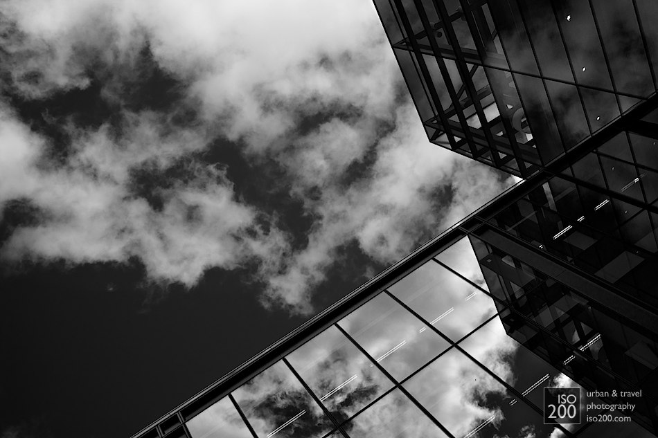
Clouds reflected in the windows of one of the new (and empty) office buildings that are part of the Quartermile development in Edinburgh on the site of the old Royal Infirmary of Edinburgh, just north of the Meadows. Designed by Foster and Partners, it is an interesting and mostly successful juxtaposition of old (i.e. late Victorian) and glass-fronted high-modernist architecture.

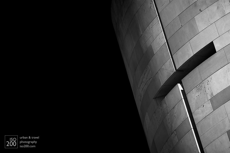
A window-slit cut into the Moray sandstone that lines the broch that forms the entrance to the National Museum of Scotland extension, built in the late 90s and designed by Benson and Forsyth. There is a mimoa.eu architecture project on the building.
Votive candles flicker in the aisle of the Church of Our Lady, in Brugges, Flanders.
Dappled sunlight through the stained glass on the stone tracery above the apse of the Saint Bavo Cathedral (also known as Sint-Baafs Cathedral, or Sint Baafskathedraal in Dutch), Ghent, Flanders.
Cherub decoration on a tomb in the ambulatory behind the apse of the Saint Bavo Cathedral (also known as Sint-Baafs Cathedral, or Sint Baafskathedraal in Dutch).
Wide angle view of the Metropolis building by Future Systems at Sluseholmen in Copenhagen’s Southern Dockland, Denmark.
For some strange reason there’s no relevant MIMOA entry.
Apse of Grundtvigs Kirke (Grundtvig’s Church) in Copenhagen, Denmark. A spectacular example of modernist, minimalist Gothic architecture. Wikipedia describes it as ‘expressionist’ but it is clearly not – it is too restrained, the decorative elements are minimised and there is a phenomenal sense of stillness and tranquility. It is a fabulous colour too – photographs don’t really capture the delicacy of the yellow/cream brickwork in the interior of the church.
Detail of the Metropolis building by Future Systems at Sluseholmen in Copenhagen’s Southern Dockland, Denmark.
For some strange reason there’s no relevant MIMOA entry.
A spiral staircase sneaks up between two cast concrete tanks, Copenhagen, Denmark.
White roof from an old fashioned buttery, Somerset, Bermuda.
Another example of why you should watch your aperture – taken at f22 – which is daft, because the resulting photo is soft (though this can be sort of fixed in post processing, why not get it right in camera?). It’s not soft through blur or shake though, but through diffraction – just because a lens has an aperture doesn’t mean you should actually use it. In this case diffraction means the lens isn’t actually capable of producing photos that are as sharp as they would be at f16.
If you’re worried about sharpness, use a tripod. Stopping down often causes more problems than it solves.
In all the talk about the engineering of cameras – pixel count, frame rates, memory cards etc. – photographers often forget that at its most fundamental level photography is about physics – it’s about light, and the manipulation of light. Your art is mediated by physics. Forget that, and your pictures will suffer.
Underneath Gibbs Hill lighthouse, Somerset, Bermuda.
This is a perfect example of why you shouldn’t use apertures below f16 – what you gain in potential depth of field you lose in shake and silly slow shutter speeds. If this had been shot at f16, ISO 200, with -1ev as it should have been, then this would have been tack sharp and worth keeping. As it is the light is fine, the clouds are good, the composition is ok… but its’ not sharp. And you will go through a phase in your photography where if it’s not sharp you don’t think twice before deleting – the sooner you get to that the better.